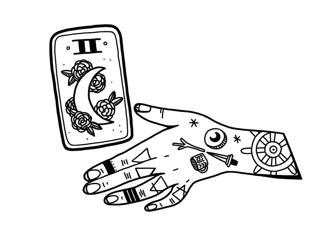
Back in October when I revealed my logo, drawn by the amazing Audra of @heavyhands.embroidery, I said that I would talk about the symbolism in it.
HIGH PRIESTESS. First of all, the tarot card featured here is Key II, the High Priestess. This card is my birth card and one whose meaning I strongly identify with. The High Priestess is at the threshold between what is known and what is yet to be discovered. I see myself in a similar role, helping people in their current understanding of a situation discover a deeper level of wisdom within themselves. For that reason, I am less like a teacher and more like a person who guides people across thresholds. Therefore, the High Priestess presides over my business. The moon and flowers are a gender-neutral way of symbolizing the developing fruits of intuition. I will also say more about the moon below.
LEFT HAND. I loved Audra’s hand designs and as soon as I saw them and just knew I wanted a hand for a logo. This is a left hand, of course, because (a) I am left-handed and (b) the left hand symbolizes the intuitive and creative faculties. Also, I asked for a hand that did not have long nails because long nails are very much not my aesthetic. Audra NAILED IT, as it were. Hands are also important to me because in addition to the fact that I use them to draw tarot cards, my hands always shake. They are a reminder for me of my own embodiment.
CRESCENT MOON. The crescent moon appears in two places on the logo—the tarot card (High Priestess) and the coin. Again, the moon symbolizes intuition for me, but it was also important for me to put the moon on my logo to acknowledge the nature of my business, that things will ebb and flow. I explicitly decided against including the triple moon symbol (waxing, full, waning) that is on the HIgh Priestess’s crown in the RWS deck because I don’t want to give the impression that I am pagan or Wiccan when I’m not. That’s also why I wanted the moon, rather than a pentacle, to appear on the coin suit symbol.
SUIT SYMBOLS. These are just FRIGGIN ADORABLE. I just wanted to include them as part of the tarot-y imagery.
ELEMENT SYMBOLS. The triangles on the fingers are the alchemical symbols for the elements. Index finger is fire, middle finger is water, ring finger is air, pinkie finger is earth. The elements are probably the most powerful tool that I use to read tarot. Some people love the astrological correspondences of the cards, some people love numerology. Me? I love the elements. They inform the meanings of the cards and show how the cards talk to one another.
SHIP’S WHEEL/DHARMA WHEEL. This one is sneaky. I believe that the tarot is a tool that we can use to navigate through our lives. It helps keep us in line with our values and our highest good. I want my readings to be a ship’s wheel for my clients, helping to them to steer through choppy waters toward the lighthouse of their values and gifts.
But this symbol also resembles a Dharmachakra, or Dharma Wheel, which is the symbol of Buddhism. I have been very clear about never wanting to use my religion as a Buddhist to make money. Those who have started following me more recently may not know that my blog used to be called Dharma Eyes Tarot. Once I knew for sure that I wanted to start offering my services in exchange for money, I changed the name. However, I put the Dharma Wheel as a secret symbol in this logo just for me. It is a reminder that my ethics and highest values must always guide my work as a reader. This is why the symbol is on the wrist—it guides what the hand does.
Leave a Reply